GERBER
GLOBAL PACKAGING REBRAND
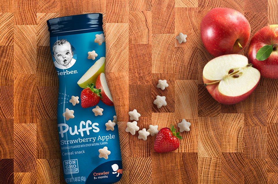
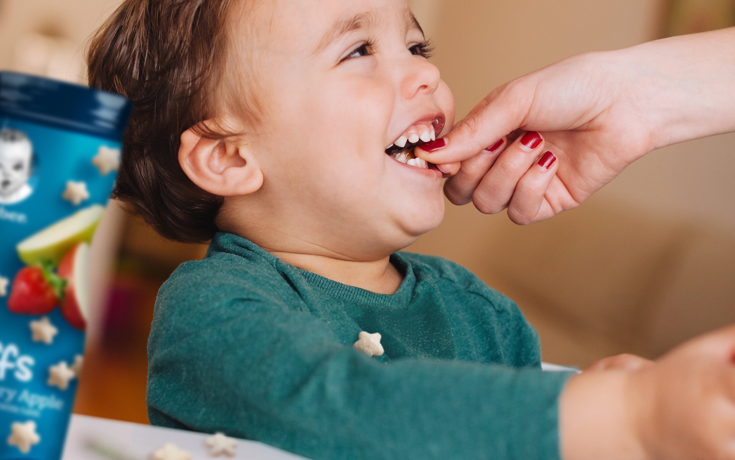
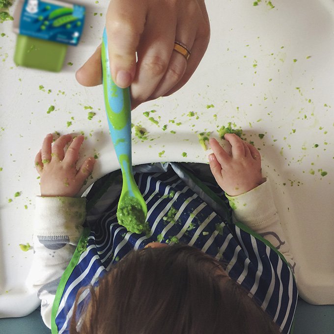
The goodness inside.
As a brand synonymous with feeding babies for nearly a century, Gerber faced the challenge of appealing to modern day parents. The solution was found by returning to the basics – real food, simple communication, and an updated mark that builds upon the brand’s decades of expertise.
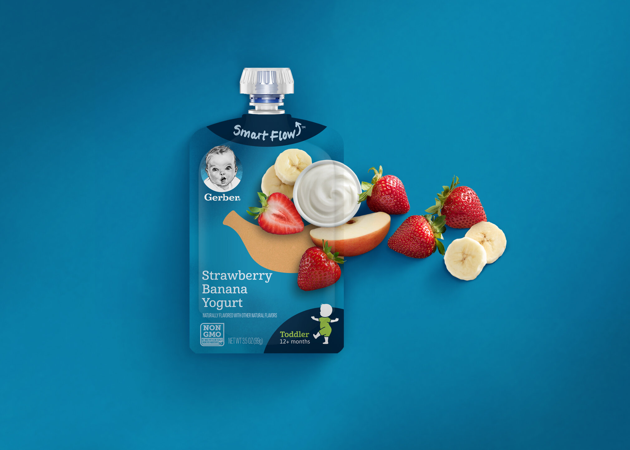
Empathizing with the challenges of shopping for a baby, the packaging design provides clear navigation, stage milestones, and simplified information for on-shelf presence. A conversational voice offers support directly on the packaging, connecting good food to good feelings.
WINNER Of Silver Graphis BRANDING AWARD


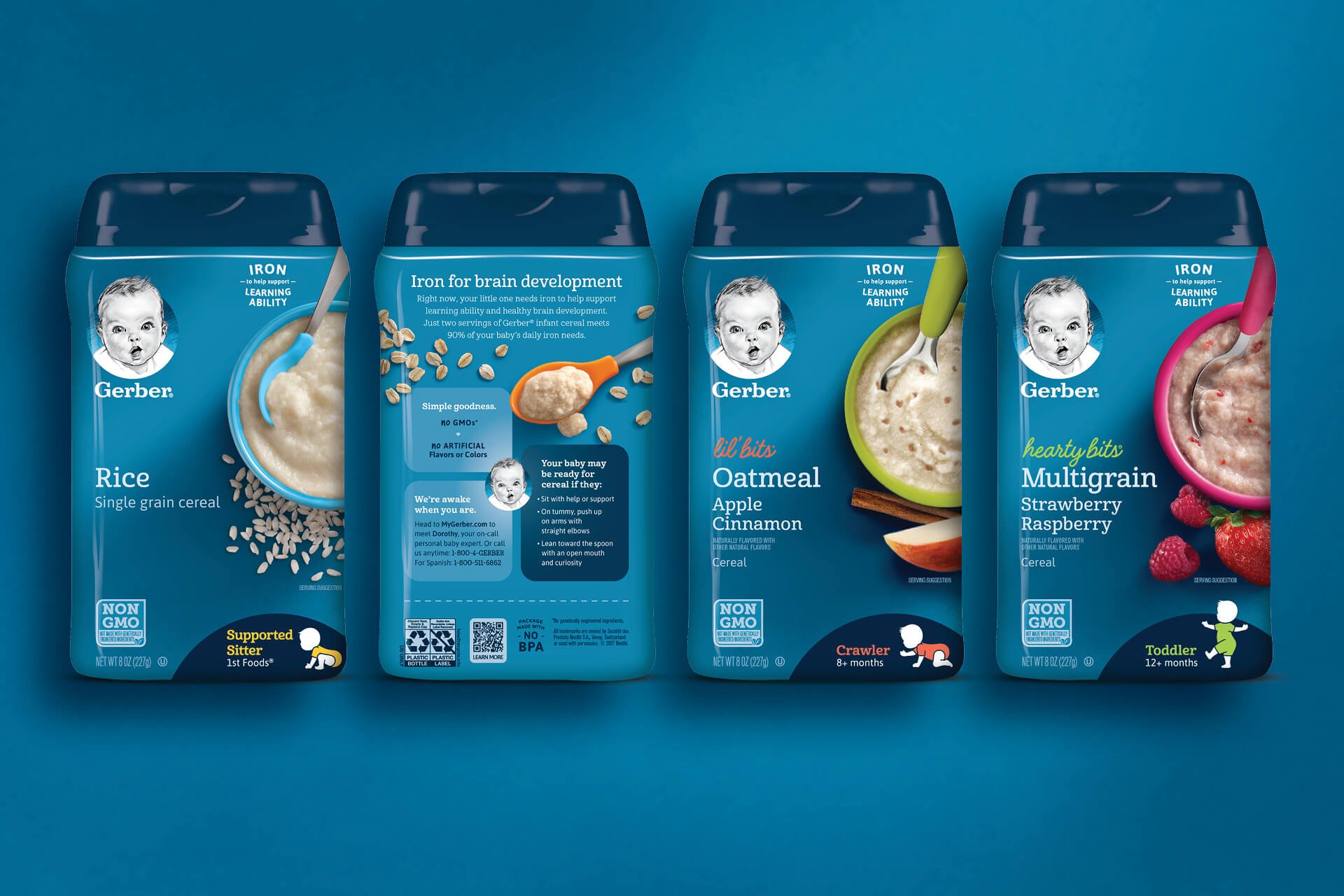
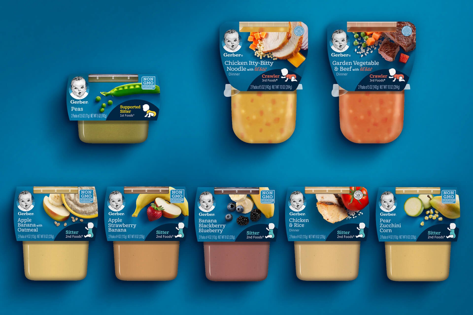
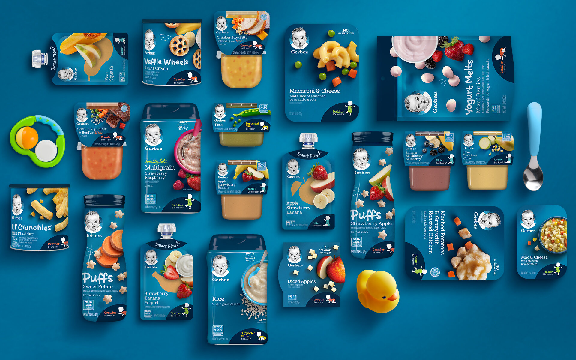
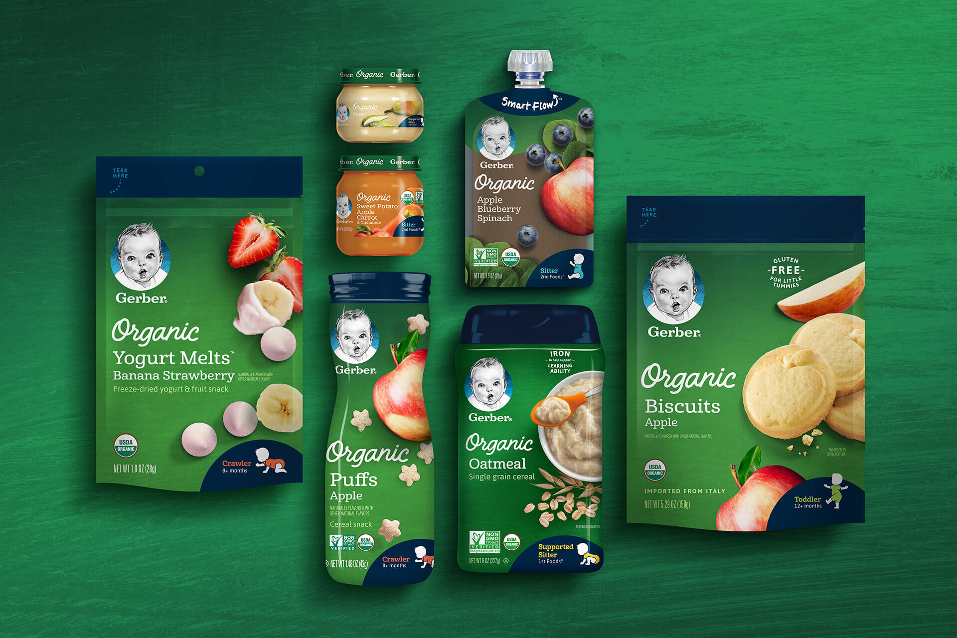
Packaging System
Rebranding a globally known and beloved brand is not for the faint of heart. I was one of a team of several designers dedicated to crafting this new chapter for Gerber as we navigated levels of approvals, feedback, and honing the system, product by product. My contributions (beyond initial concepts for the system at large, which sadly were not chosen) came in the form of comprehensive type studies and selection, the creation of system wide badges, claims, and call-outs, the redesign of the Gerber “nutritional compass” found on the back of all products that afforded the space, and the development of the Organic subline of packaging.
Fun Fact
My handwriting is trademarked for Gerber’s Smart Flow packaging technology, which helps their tasty and nutritious purees travel safely into babies’ mouths. The idea was to call attention to an important and proprietary feature in a human and trustworthy way to underline the “hand-touched” aesthetic of the overall system.